
Android is getting a facelift. At Google’s I/O keynote last Wednesday, the company detailed some big changes coming to the platform this fall, highlighted by something the search giant is calling “material design.” Not that Android looked all that bad to begin with, especially in Android KitKat. But Android L, as it’s being called, is a complete reimagining. This is what Android fans will see not only across mobile, but on the desktop, watches and TVs, too.
Google describes material design as something that uses bolder graphics, more fluid motion and more tactile surfaces. All of this combines to create an even more intuitive experience, something that will be consistent across all of Google’s platform. In the Developer Preview, it’s difficult to get a thorough idea of what material design will bring to Android when it becomes available to consumers, but it’s just enough for us to get a taste. And we can’t wait to see more.
We got the software up and running on a Nexus 7, and although material design isn’t present across the entire OS just yet, there are already some big changes in how the software looks and behaves. In some ways the emphasis on design is akin to Apple changing from iOS 6 to iOS 7. And from what we can tell so far, Android will be better off for it. Everything is more fluid, more accessible. Playing with something like the calculator in Android L shouldn’t bring so much joy, but it does. And so on.

On the home screen, you can already see that the software buttons are new—now a triangle, circle and square. And there are other little flourishes as well; Google uses surfaces and shadow in Android L that allows the company to better convey a physical structure. This helps Google explain “what can be touched and what can move” within Android L—these are the kind of changes users will see throughout the OS when it launches this fall.
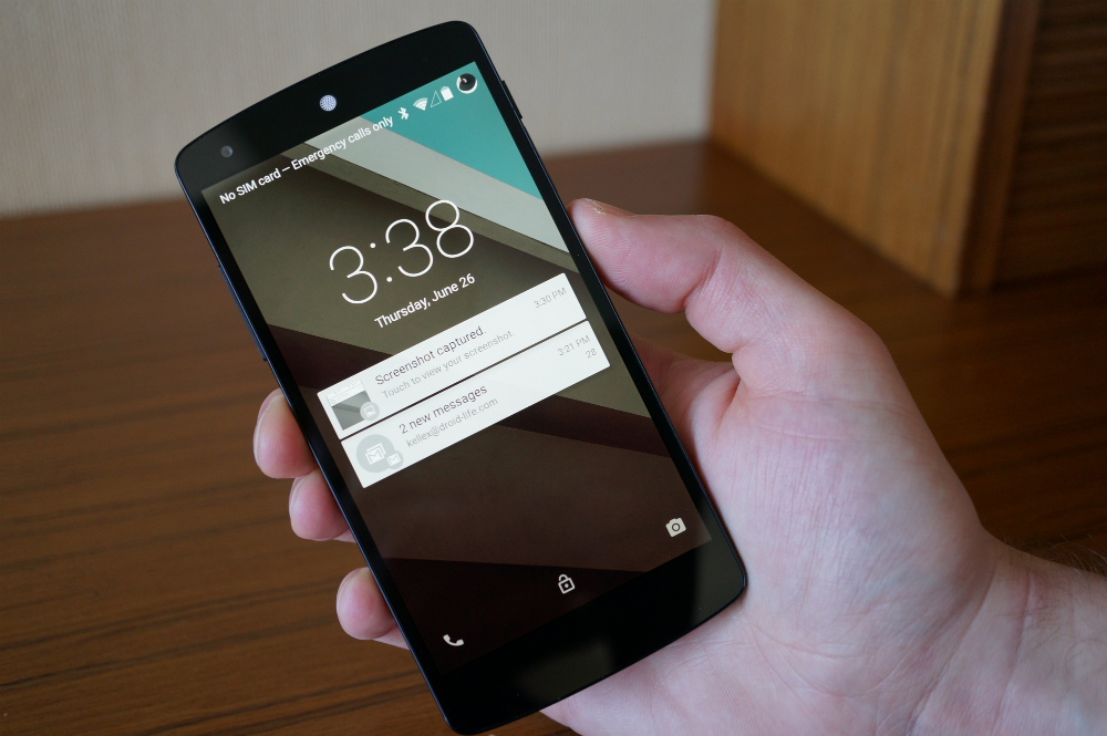
Moving deeper through the developer preview, notifications are also receiving a big makeover, both in looks and in functionality. They now show up in a beautiful card-style, similar to Google Now. The notifications are also active, too; you can either swipe to dismiss them or swipe down to interact and replay—and you can do this from any app you’re in. It isn’t quite so flushed out just yet, but we can’t wait to see how the changes affect the experience in the long term.
Since we ran the Android L preview on the Nexus 7, we couldn’t really see the new dialer in action, but we did get a feel for how apps will change with the new-look calculator. I know, it’s just a calculator. But you really get a sense for the bright colors, geometric shapes and shadows used to indicate what and where the software can be touched. Everything you touch animates, too, and looks very, very beautiful.


Elsewhere, Google is also making changes to multitasking, which is now laid out in a kind of rolodex. Here, you’ll not only see your most recent apps, but also tabs open in Chrome, thought that’s not present just yet in the current preview. The layout is super simple and easy to use—you can swipe stuff away like you normally would in existing version of Android, or you could hit the little X in the top right corner. We can see this implementation getting really messy with a lot of apps and tabs running, but it’s simple to quickly swipe through your recently used apps.
Google’s Android L is still early in development—it doesn’t even have a proper name! Licorice? Lollipop?—but we’re still really excited to see what material design will look like across the entire operating system. From what we’ve seen so far, we’re excited about the direction Google is headed, and can’t wait to see what the finished product has to offer when it hits this fall.
source-tehno bufallo
0 comments:
Post a Comment